How many users include the word vegan in their Twitter profile? I can tell you the exact number I have observed for one place and one time. The number is 7,316 for American users in 2012. Call that number the incidence - it’s a raw count.
Now say I want to compare 2012 to 2020. In 2020, the incidence of US vegan users was 13,756. Wow, that’s a lot more! But you suspect maybe there were a different number of Twitter users to be observed in 2020 than in 2012, and you are correct. The total number of unique US accounts I observed in 2012 was about 10 million and in 2020 there were about 10.2 million, i.e. 200,000+ more opportunities to observe vegans.
I have included code blocks for those who wish to see implementation details.
Code
library(tidyverse)# Download a csv file containing US data for tokens at annual resolution.# Read about the data in the text file at https://osf.io/3gjtatac =read_csv("https://osf.io/download/cdzsb/")# Become familiar with the data file.str(tac) # Structure of the data.tac %>%slice_sample(n =5) # Example rows.# How many users include the word vegan in their Twitter profile?tac %>%filter(token =="vegan"& obsYear ==2012) # in 2012tac %>%filter(token =="vegan"& obsYear ==2020) # in 2020# Note that the numerator column contains the incidence.
3.2 Prevalence affords comparison.
We need to do some simple math to compare apples-to-apples. We might divide the incidence by the total number of observed accounts to get a proportion. When we do so, we find vegan proportions of 0.000735 for 2012 versus 0.001351 in 2020.
Yuck. People - even smart ones like you - have trouble with fractional numbers like these. When asked to compare fractions, they take longer and still make more mistakes then they do when comparing counting numbers. To avoid this unnecessary cognitive hurdle, I consistently express the popularity of signifiers in bios in terms of prevalence per 10,000. Consider Figure 3.1. It shows prevalence for vegan among US users for the years 2012-2023. The y-axis has whole number, human-friendly units.
Code
# Visualize vegan prevalence over time.tac %>%filter(token =="vegan") %>%mutate(finePrevalence =10000* numerator / denominator ) %>%mutate(Signifier =factor(token, levels =c("vegan")) ) %>%ggplot(aes(x = obsYear, y = finePrevalence, color = Signifier, shape = Signifier)) +geom_path(linetype ="longdash", linewidth =1) +geom_point(size=4) +scale_x_continuous(limits=c(2012,2023), breaks =2012:2023, minor_breaks =NULL) +scale_color_manual(values =c("#5c8326")) +ggtitle("Estimated prevalence of vegan signifier", "within US Twitter users' profile bios 2012-2023") +xlab("Year") +ylab("Prevalence\n(per 10,000 accounts)") +theme(text =element_text(size=14)) +theme(axis.text.x =element_text(angle =45, hjust =1)) +theme(legend.position =c(0.75, 0.5),legend.background =element_rect(fill ="white", color ="black")) +labs(caption ="Source: Ipseology - a new science of the self\n \uA9 Jason Jeffrey Jones. You may share and adapt this work under terms of the CC BY 4.0 License.") +theme(plot.caption =element_text(size=10, color ="#666666"))
Figure 3.1: Prevalence of vegan over time.
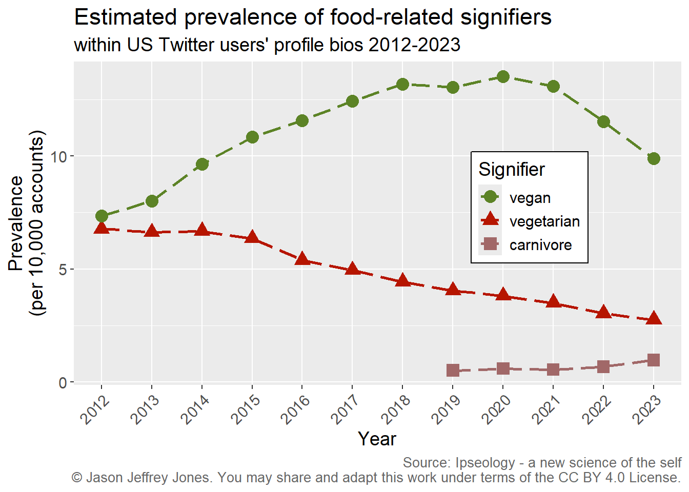
Now we have a consistent, simple unit of measurement. Prevalence allows comparison across time and between signifiers. Consider Figure 3.2. Among the observed users, clearly vegan increased in popularity while vegetarian decreased. Carnivore rose above threshold in 2019 and grew through 2023.
(The threshold to be included in the data was 1 or more per 10,000 after rounding. omnivore and pescatarian never exceeded threshold in any of these years. Using a threshold eliminates the long tail of signifiers used by only tiny fractions of the user population and all tokens that would uniquely identify one person.)
Code
# Multiple signifier series.tac %>%filter(token %in%c("vegan", "vegetarian", "carnivore") ) %>%mutate(finePrevalence =10000* numerator / denominator ) %>%mutate(Signifier =factor(token, levels =c("vegan", "vegetarian", "carnivore")) ) %>%ggplot(aes(x = obsYear, y = finePrevalence, color = Signifier, shape = Signifier)) +geom_path(linetype ="longdash", linewidth =1) +geom_point(size=4) +scale_x_continuous(limits=c(2012,2023), breaks =2012:2023, minor_breaks =NULL) +scale_color_manual(values =c("#5c8326", "#B61500", "#a16868") ) +ggtitle("Estimated prevalence of food-related signifiers", "within US Twitter users' profile bios 2012-2023") +xlab("Year") +ylab("Prevalence\n(per 10,000 accounts)") +theme(text =element_text(size=14)) +theme(axis.text.x =element_text(angle =45, hjust =1)) +theme(legend.position =c(0.75, 0.55),legend.background =element_rect(fill ="white", color ="black")) +labs(caption ="Source: Ipseology - a new science of the self\n \uA9 Jason Jeffrey Jones. You may share and adapt this work under terms of the CC BY 4.0 License.") +theme(plot.caption =element_text(size=10, color ="#666666"))
Figure 3.2: Prevalence of vegan, vegetarian and carnivore over time. Note that we have measured the popularity of signifiers consistently, persistently and precisely.
Using the prevalence measure, we can perform analysis over time. What about space? Fortunately, our Twitter data is multinational; let’s compare prevalence of the same signifiers across countries. Chapter 4